I was tasked with working closely with a client within a 3-week design sprint to provide a solution to their problem and bring to light their app idea. I was the sole designer for this project, however, I did work closely with my client to ideate a solution.
Client Background:
The client Teresa Razo, owns two wildly successful restaurants in Orange County and is President of the Orange County Restaurant Association. She does large-scale and extensive philanthropic work and has been showcased in the L.A. Times, OC Register, and BuzzFeed for her work and businesses.
The age old question - "Where should we go out to eat?"
Since this was a whole new concept and there was no existing platform to improve or extract data from, I was really starting from scratch. Fortunately, I stumbled on a research report created by TouchBistro. The study was conducted in 2017 were they surveyed over 500 Americans to understand how restaurant goers choose the places they dine at, including their dining habits, decision markers, and deal breakers.
This report was monumental in helping me in ideating my design solution and laid out some key insights on the different variables one weights when deciding where to go out to eat. CLICK HERE to see the original report.
TouchBistro 2017 Report - "How Diners Choose Restaurants"
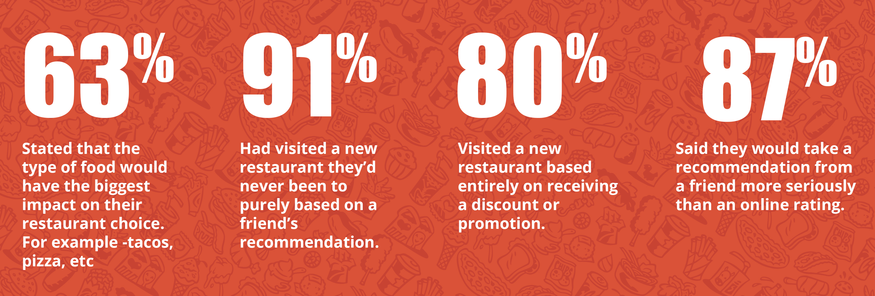
These 4 key insights played a critical role in helping me frame out several ideation solutions as well as helping further define the problem.
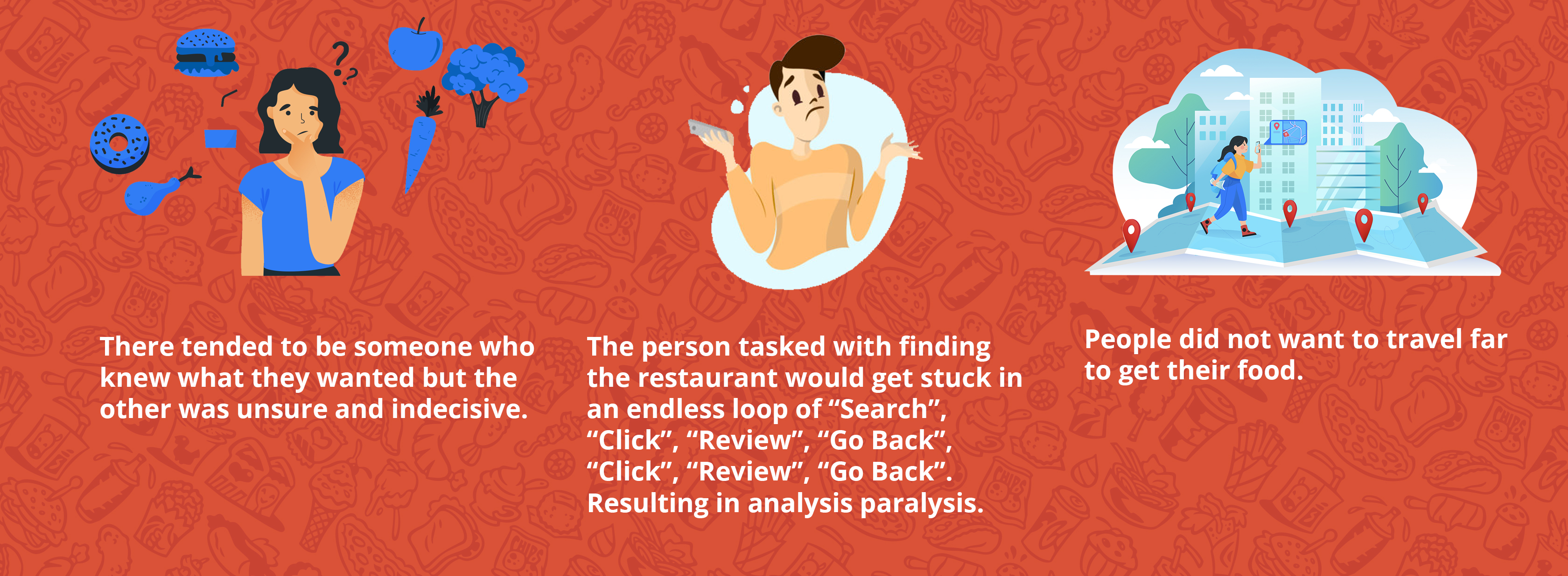
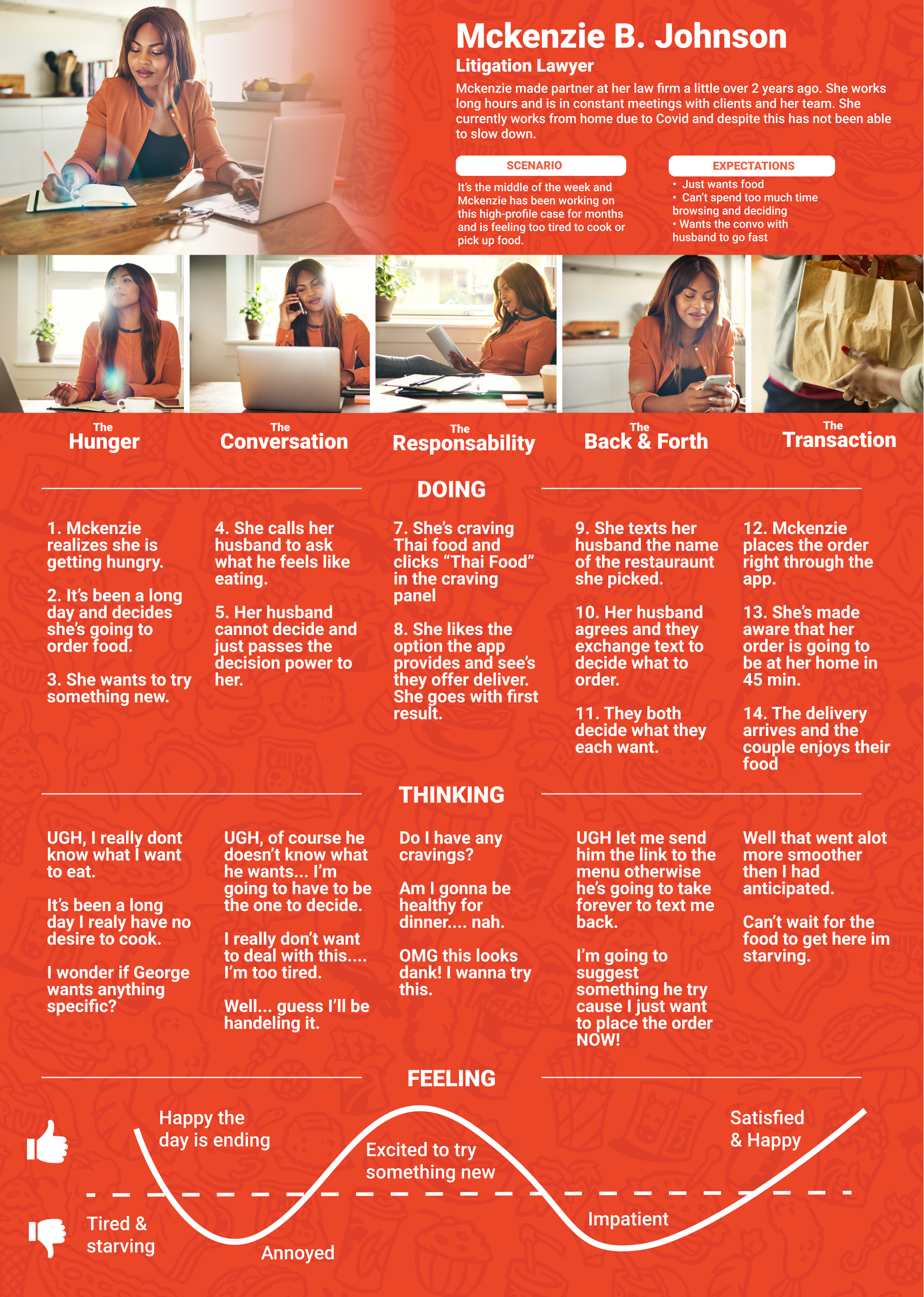
Once I had fully digested the TouchBistro research report, I took a moment to step back and critically think about what are some of the major pain-points a person encounters when trying to decide on a place to eat. So I conducted user interviews to see what a persons normal go to process is when finding a place to eat. The interviewes were straight forward and all I asked people was...
"Can you describe a time you were with a friend (or) significant other and you two wanted to go out to eat. What happened and what did you do?"
Here is what I noticed.
Once I quantified all my findings from the TouchBistro research report and the user interviews we quickly realized the bigger issue at hand was more complex. During the first sketch sessions I was simply designing to solve for one use case; people who had no idea where to go out to eat. But my client and I came to the conclusion that there we really 3 main use cases. This also helped define the problem statements.
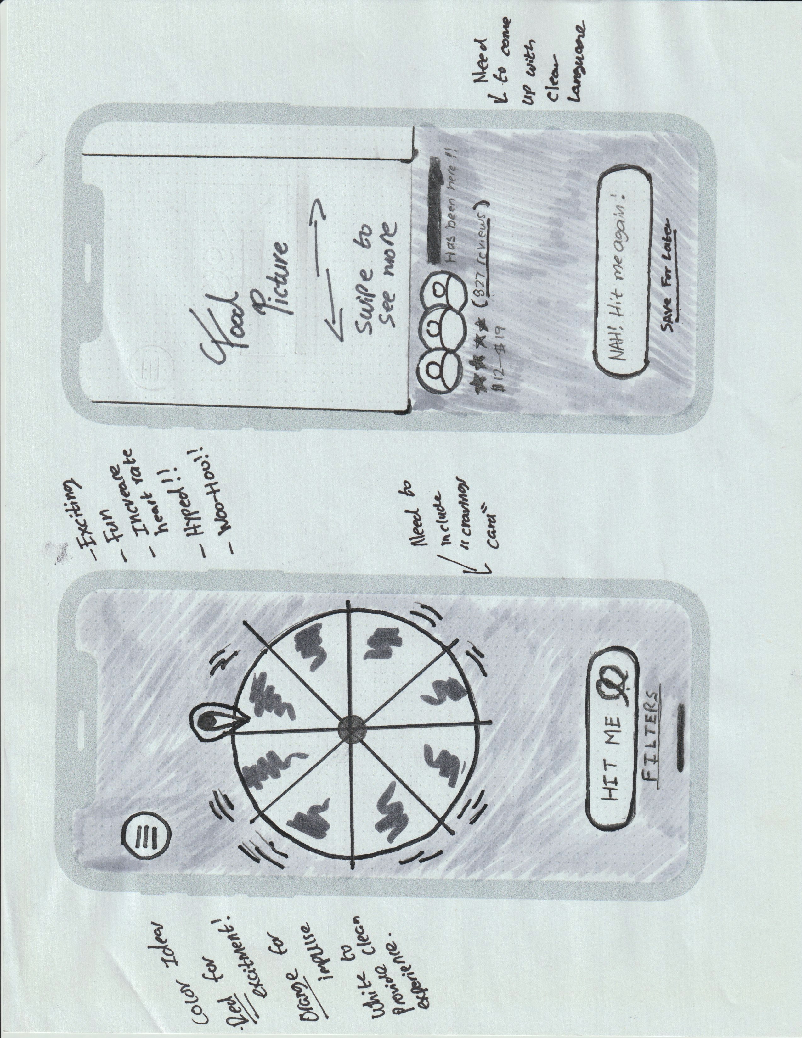
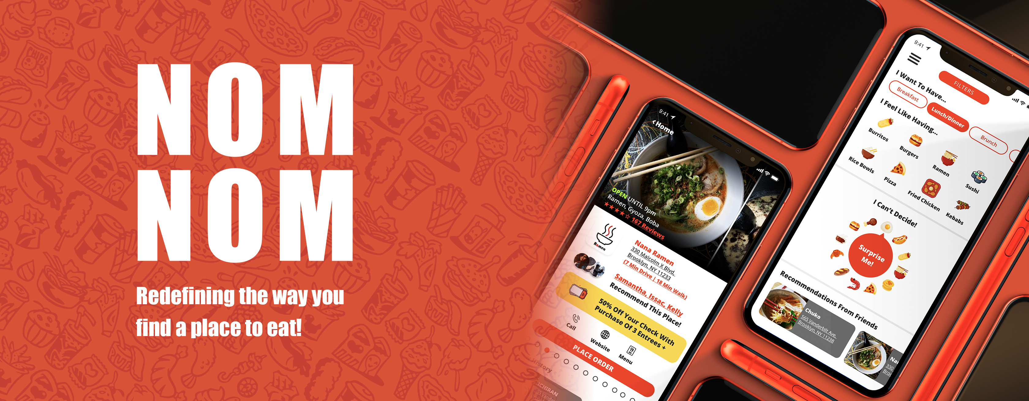
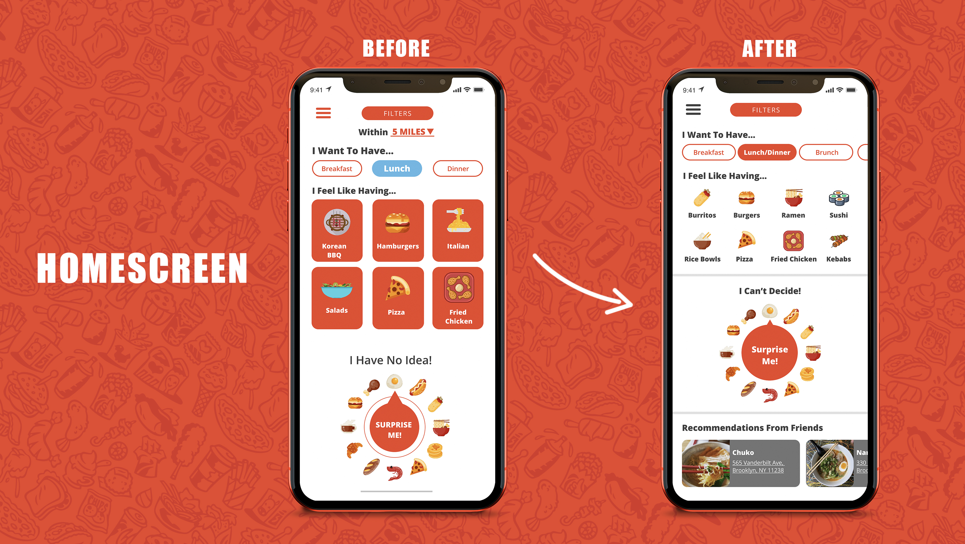
The first sketch design idea was simple. The app would comprise of a straight forward "fun" wheel where a user can spin it and be given a random restaurant recommendation. When getting feedback from client and others it seemed like a good start. However, many people brought up that it only solved one singular use case and that they wished that it had some more robust options to explore places to eat.
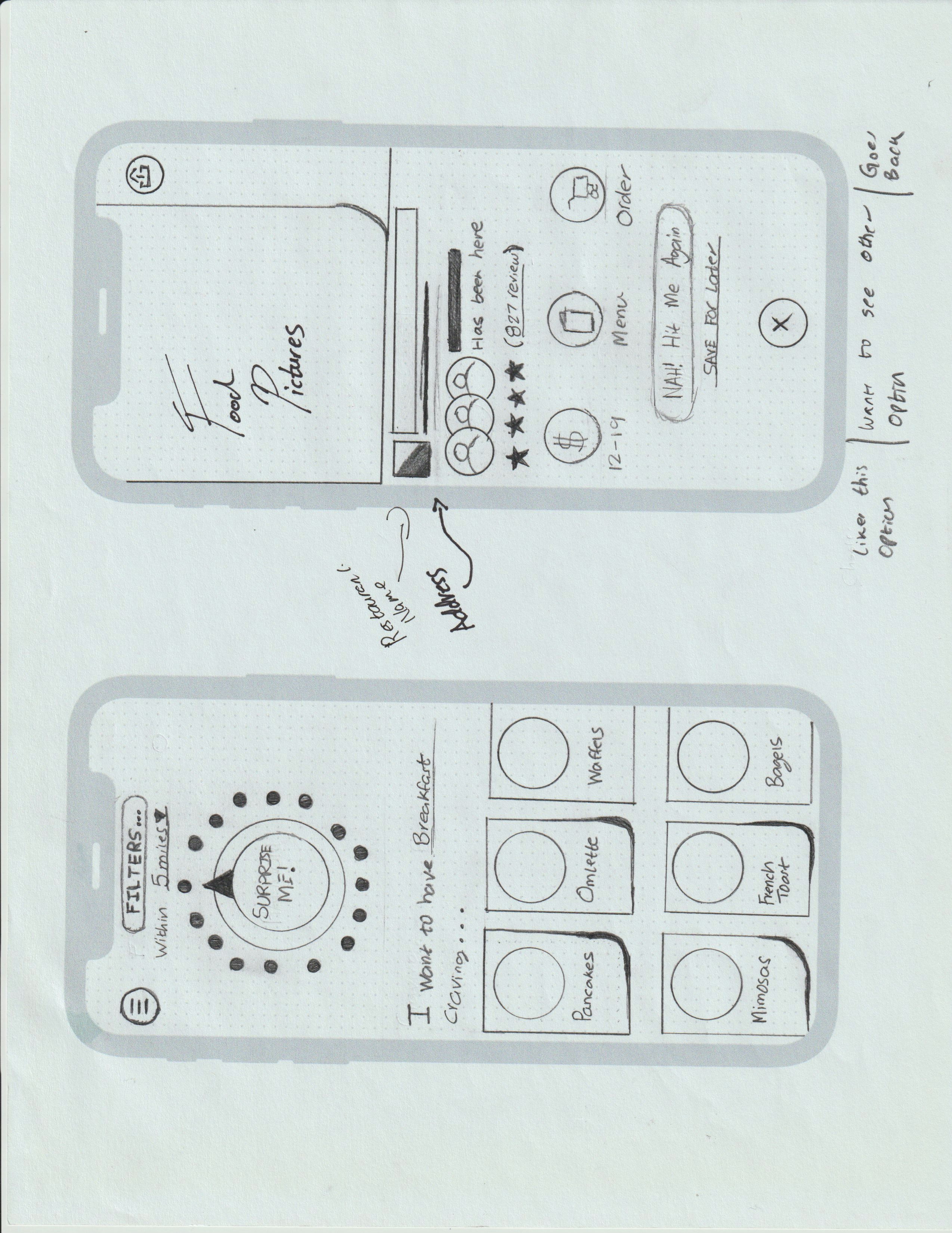
Critically taking into account the takeaways from the TouchBistro report I added in a card design concept to the homescreen, giving the user more options in narrowing down their hunt for a place to eat.
At this point of the design solution the user can decide from 2 ways of finding a restaurant
This served the most simplified and optimal solution as it took into account any scenario a user may be in during their food finding journey, and, it helped guide their decision making process by providing limited options dictated by what is available around them.
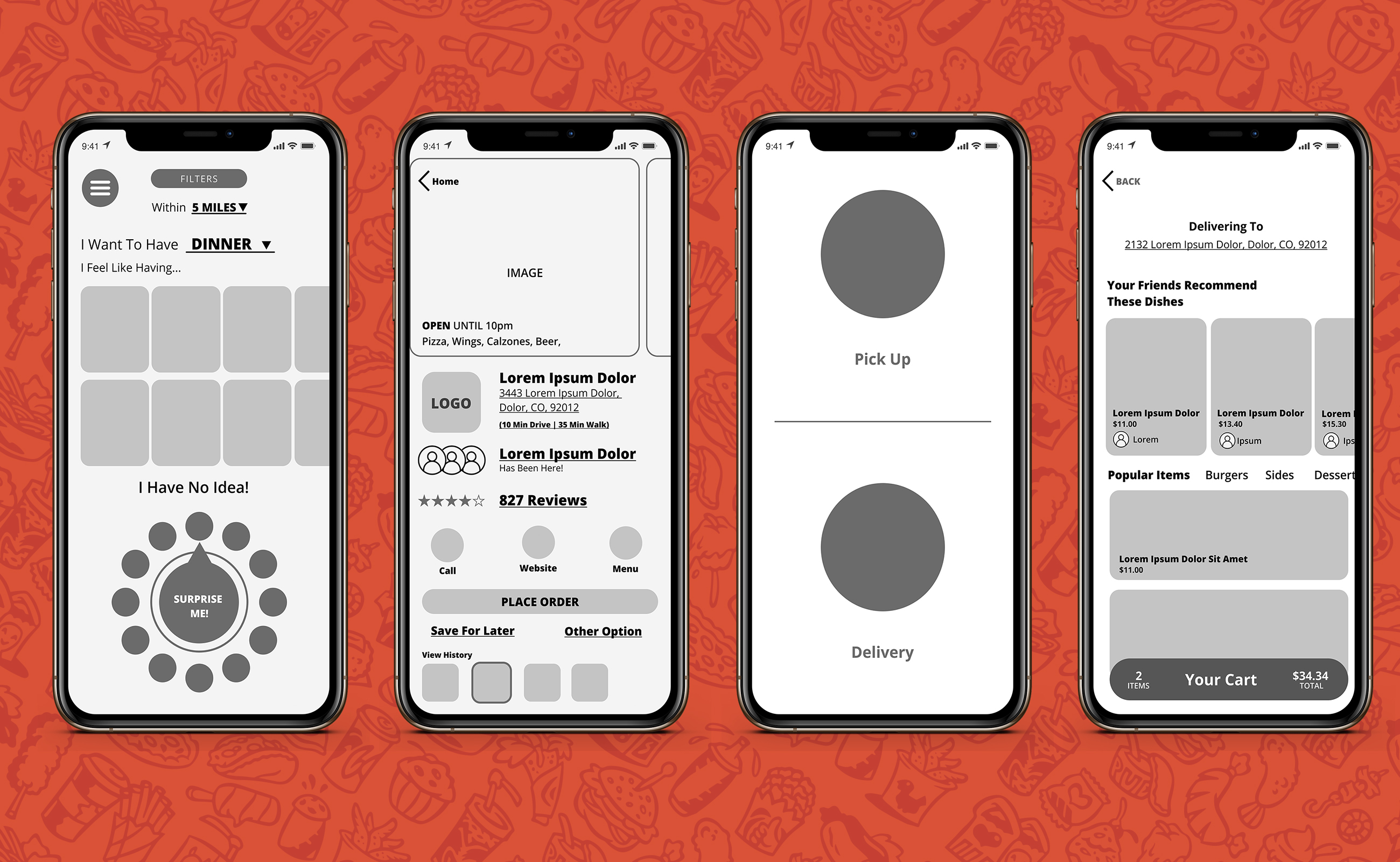
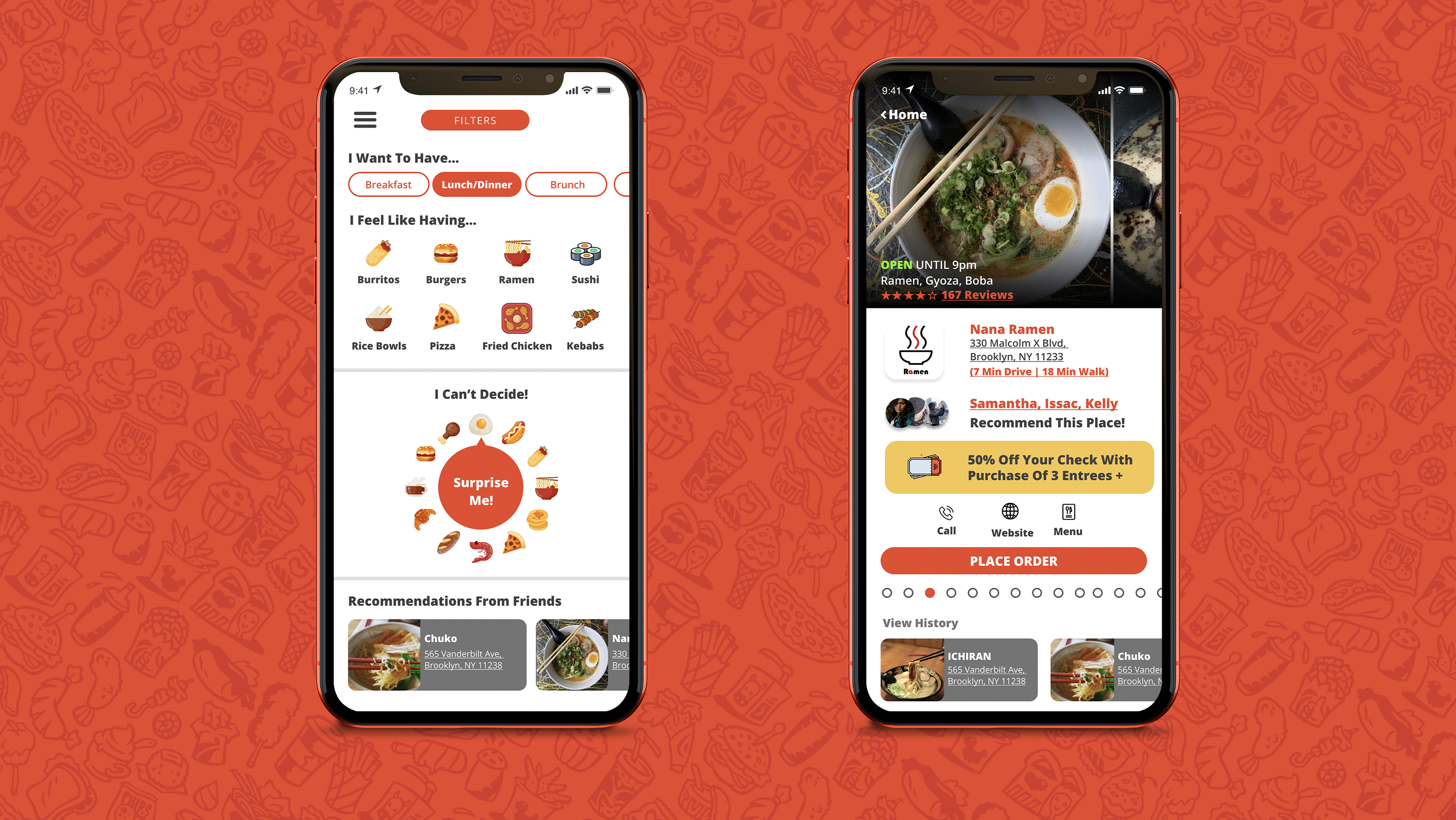
When I began to create my digital wireframes and I received feedback from my mentor. We quickly surmised that it did not make sense to have the "Surprise Me" button at the top of the homescreen and the card design on the bottom. By flipping the order it created a more methodical experience for the user. So in the event that they had no idea what they wanted to eat (as in they didn't know if they wanted pizza, tacos, or ramen) they could default to the "surprise me" function on the bottom of the screen to be given a random recommendation.
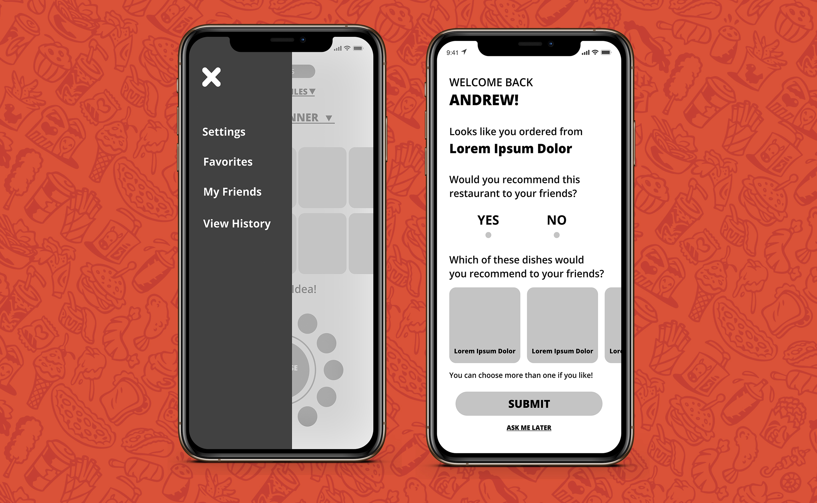
Another notable improvement at this phase of the ideation process is that after getting feedback from my client and colleagues one thing I did not design for was the ability for users to see their "view history". Meaning, if a user scrolls through three restaurant recommendations; there wasn't a functionality for them to be able to go back and view the previous options they were shown.
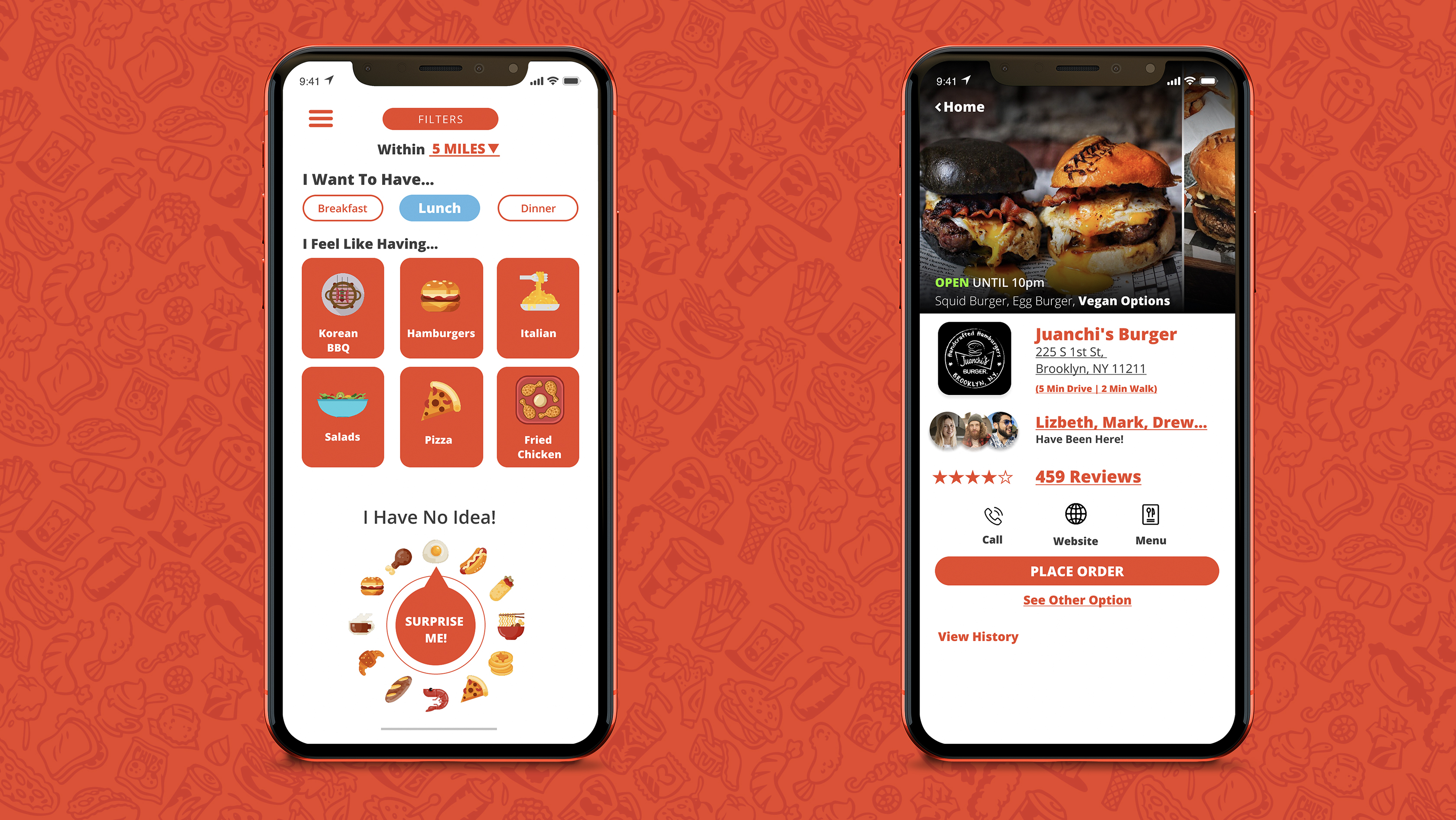
Upon completion of prototype 1.0 I quickly realized one potential problem with the design solution. Will users want to be shown restaurant recommendations one at a time as opposed to seeing a search result list?
I recognized that this went against a major mental model users are accustomed to when searching. For example when you're browsing through Yelp and Google you're never presented one option at a time.
So, I decided it was time to test the design solution to get unbiased constructive criticism.
Would users enjoy this experience? If not, why not? Here is what I discovered!
Objective:
Participation Criteria:
Recruitment Plan:
Paid unmoderated testers through maze.design, 35 tests were conducted. These testers had no idea who I was, and had never seen this app before.
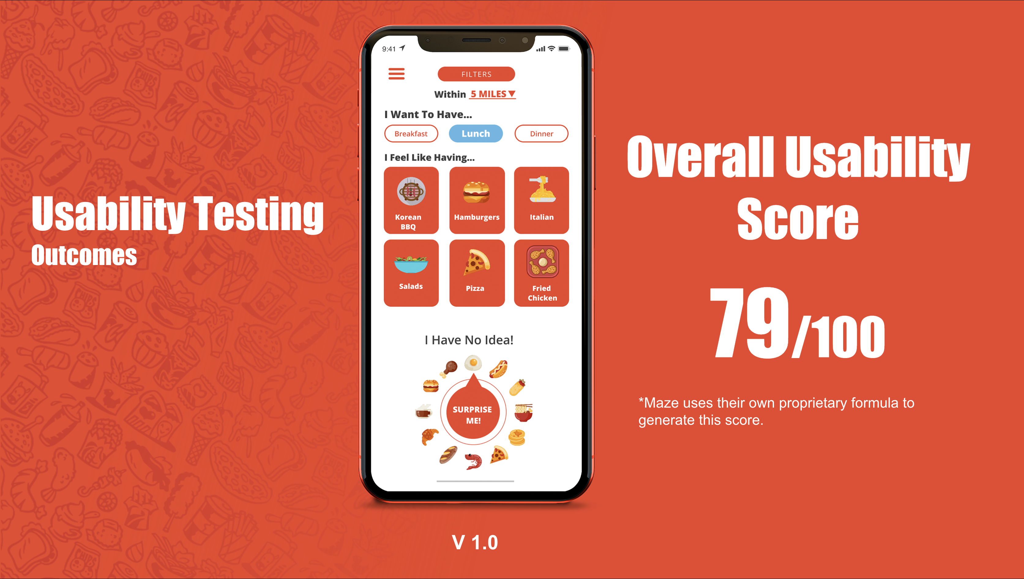
Overall users enjoyed the prototype with many stating it was more intuitive then other platforms such as yelp.
But the million dollar question was.... did users enjoying viewing restaurant recommendations one at a time?
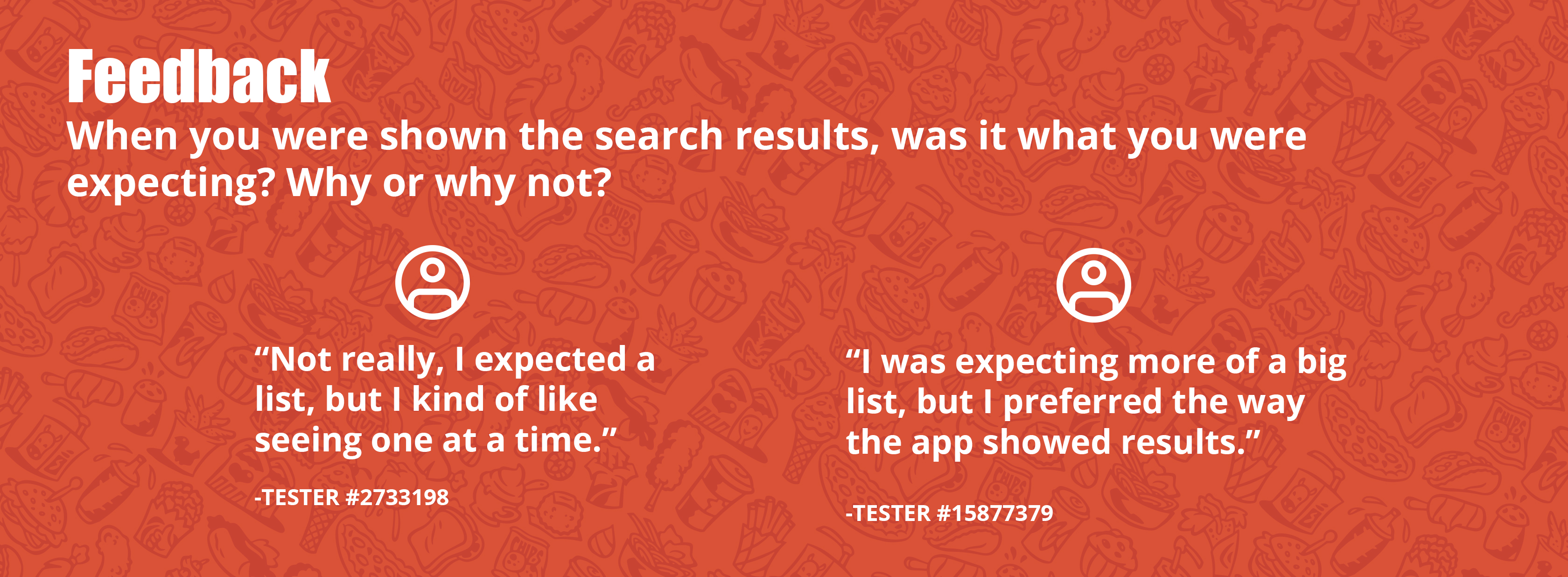
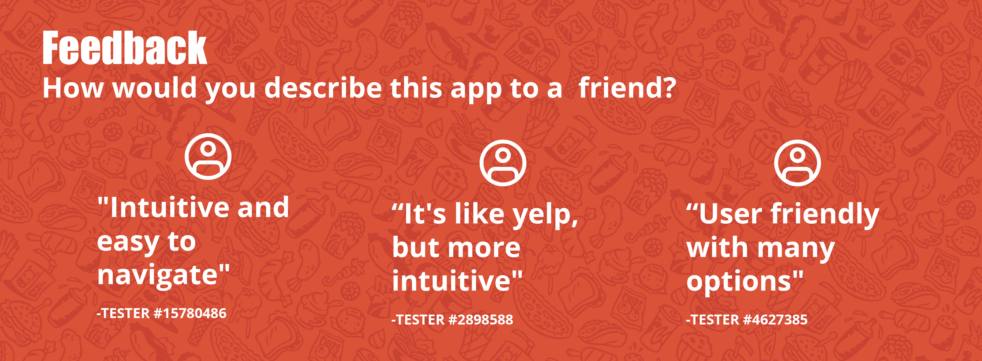
The feedback I received was split down the middle.
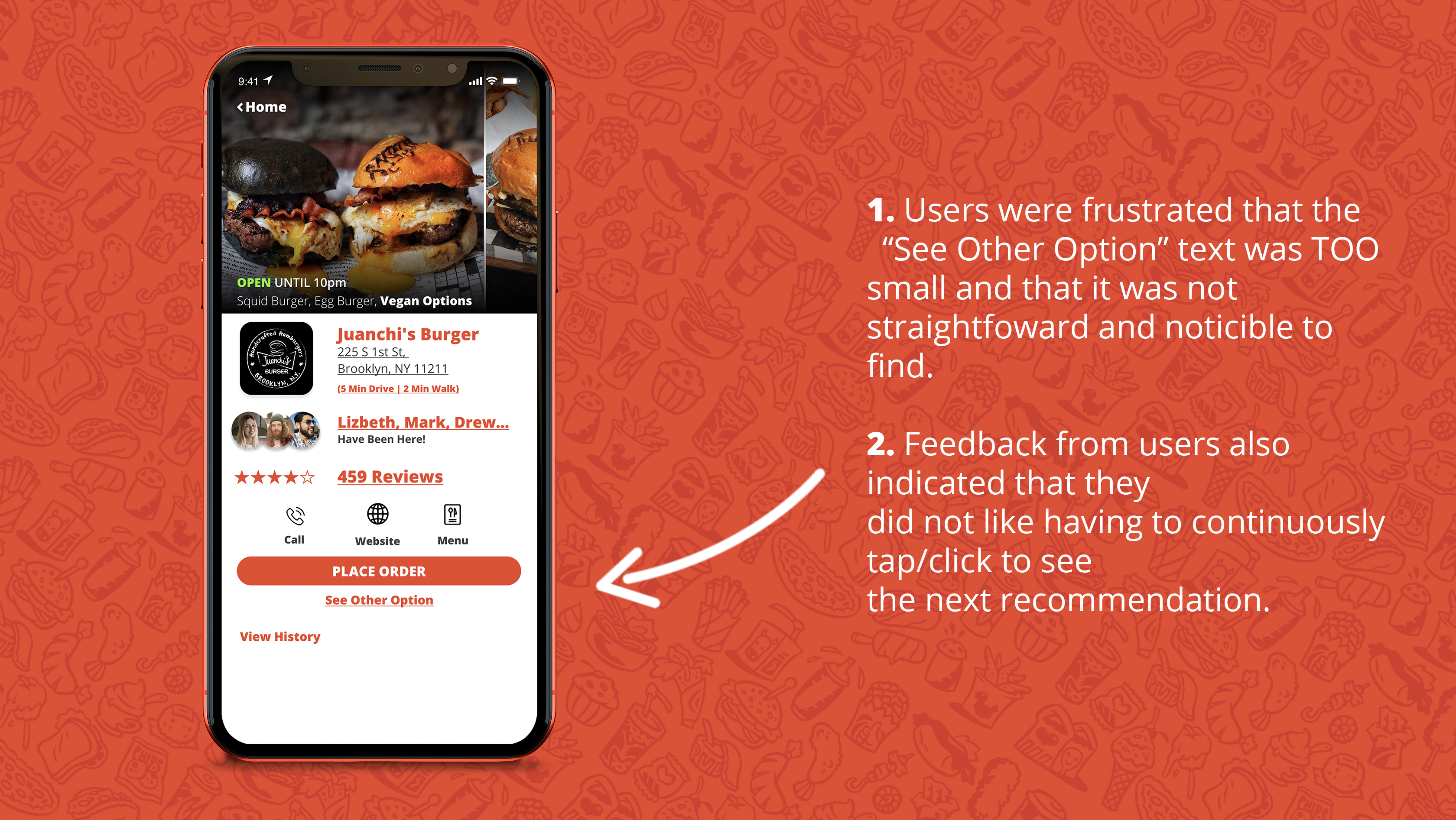
With this feedback in hand, I came to the conclusion that this created a new problem to solve in the iteration of prototype 2.0
How may we provide a straightforward and intuitive search experience that shows recommendations one at a time without exhausting the user with continuous clicking/tapping?
After analyzing the feedback from the usability testing and collaborating with my client. Here are the improvements I made.

Although it is not recommended to go against mental models, I learned to take a risk and not fear going against the grain at times if you can justify your decision based on user feedback.
This was the first time I did a "paid" usability study with people who did not know who I was and had never seen this app concept. The feedback I received regardless of the positive and negative comments was tremendously invaluable in guiding our thinking to improve the design solution.
Lastly, JUST KEEP ITERATING!