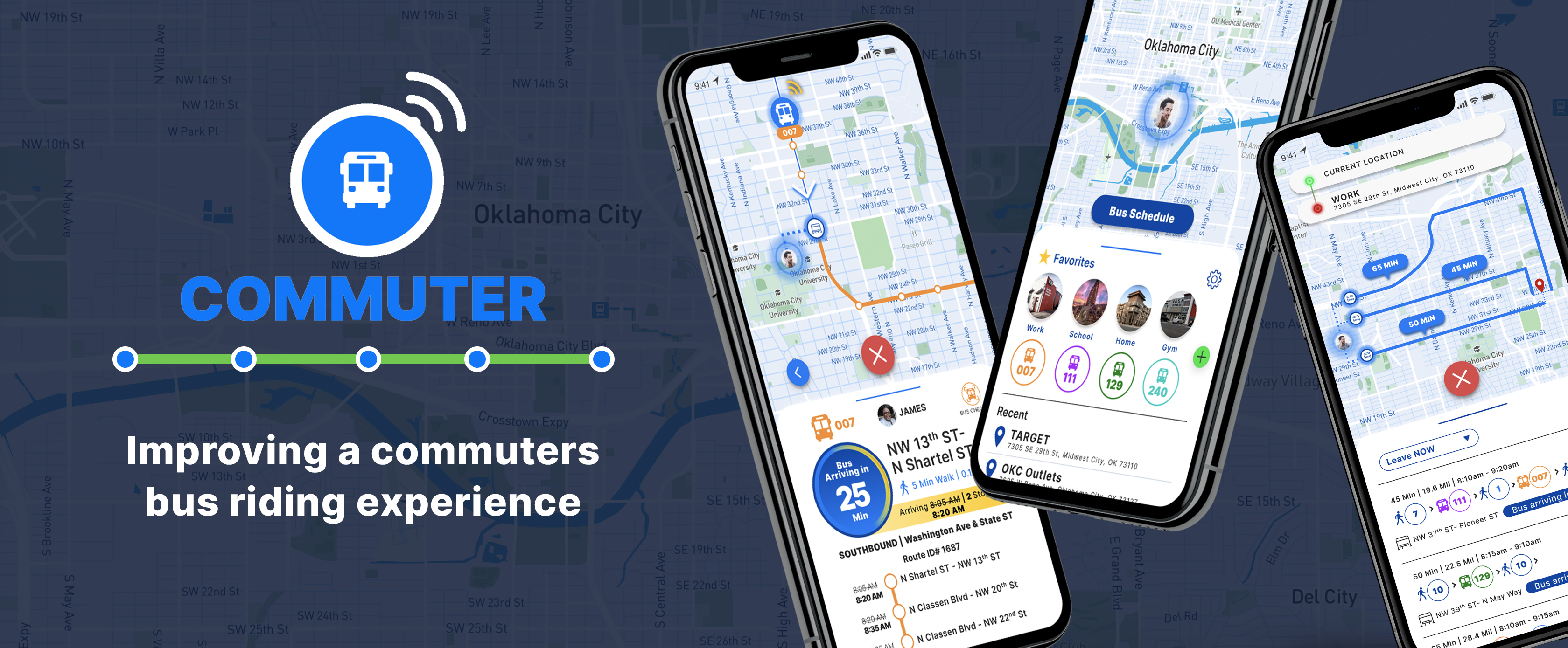
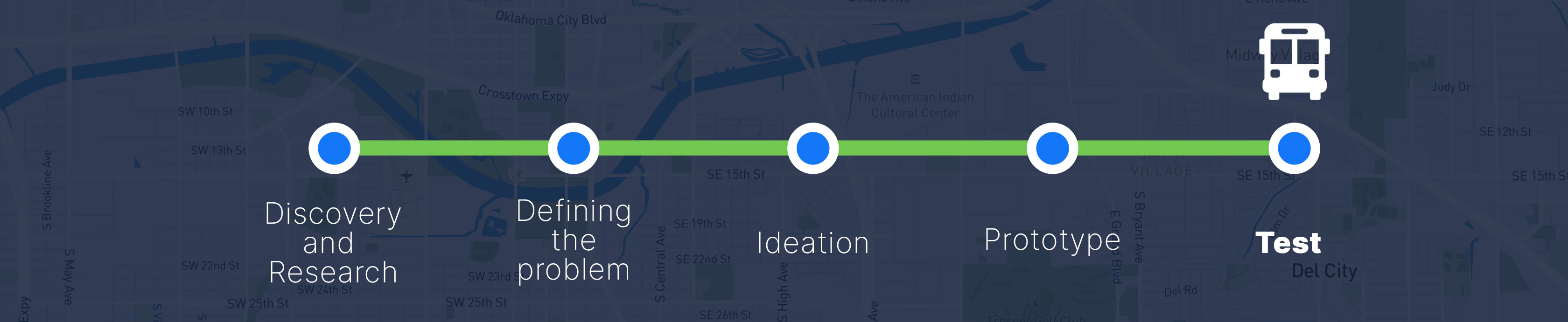
This case study describes my first major UX project for my 6-month immersion boot camp at Thinkful. They provided a prompt and problem to solve relating to a bus app. I was the sole designer and researcher on this project. I worked closely with my classmates and my mentor to receive continuous feedback and ideate several solutions.
Ideate a public transit app for a Mid-Sized metropolitan city in the Midwest to serve thousands of commuters. Due to expansion, the agency has added several new buses and bus routes to their service. Many of these routes converge at one particular hub on Washington & State.
The first step I took in ideating my design solution was to conduct a survey.
Research Survey Objective:
Participation Criteria:
Screener Question:
Do you use the bus as one of your primary modes of transportation?
At this point I was thinking....
"Will I be able to uncover new insights not illuminated by the prompt? Will my research findings support the critical problems laid out in the prompt?"
At first my challenge was to find people who actively rode the bus as their primary transportation method. Trying to leverage Facebook and other social networks did not yield any luck since I could not find any groups, forums, or communities dedicated to people who used the bus.
So I reached out to several friends who lived in metropolitan areas and asked if they would be willing to share my survey link to their network of friends on social media. My logic was that most people who live in dense urban cities tended to ride the bus. I figured if their network of friends lived around them, I'd be able to get viable survey responses that passed the screener question.
In the end I generated 84 successful survey responses that cleared the screener question along with 37 answers to the follow-up question I asked for those who indicated they did not ride the bus as their primary method of transportation.
Research Takeaways
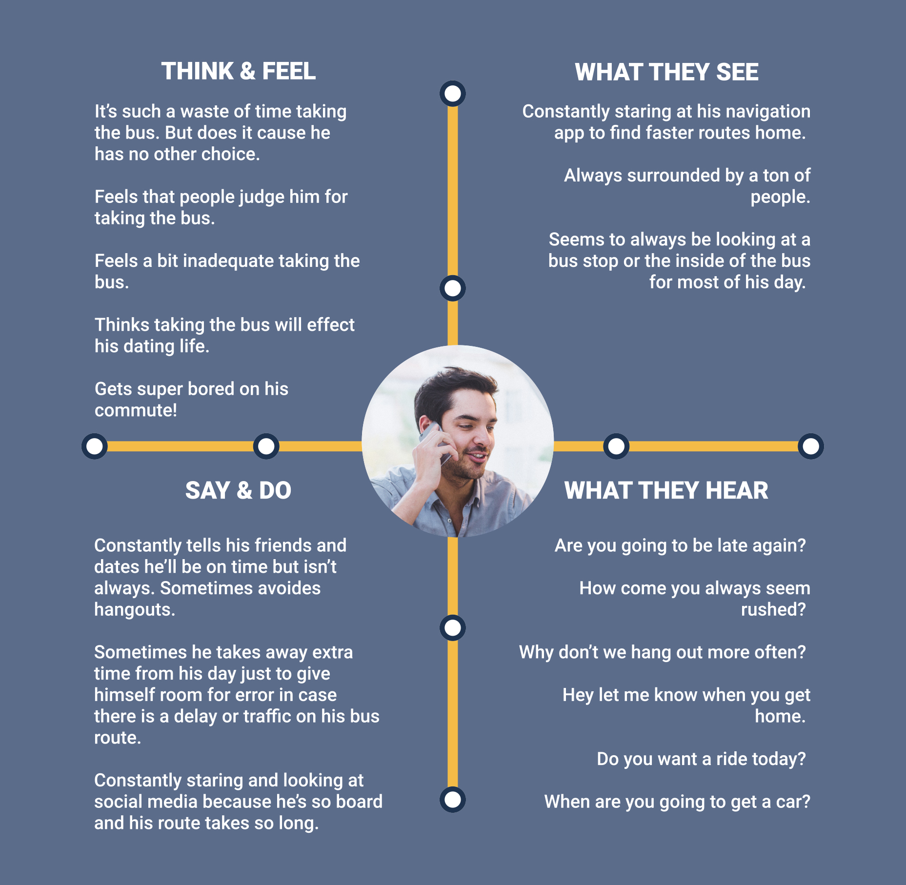
Overall my findings supported the problems described in the prompt. Something new I did learn was how stressful it could be for riders to take the bus, along with their high distrust for the bus system.
Once I had finalized and aggregated all my data from my survey. I developed an empathy map to set the tone of what it's like to ride the bus in daily commutes.
Defining the Problem
Having had proved the prompt's initial problems through my research. I refined the problem with three problem statements.
Competitive Analysis
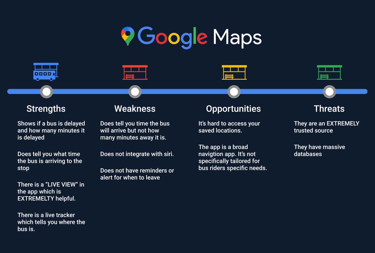
Once I had defined the problem, one thing that was made clear during my research was that an overwhelming amount of survey responders indicated they used Google Maps during their daily commutes on the bus. A whopping 90% of the survey responses laid claim to using Google Maps. The runner up was Citymapper at 10%. However, when deciding what apps to conduct a competitive analysis for, the TRANSIT app caught my attention mostly because they had live tracking as part of their experience. Plus, they grew popular in the midwest and were awarded several prestigious design awards by Apple and Google.
Once I had defined the problem, one thing that was made clear during my research was that an overwhelming amount of survey responders indicated they used Google Maps during their daily commutes on the bus. A whopping 90% of the survey responses laid claim to using Google Maps. The runner up was Citymapper at 10%. However, when deciding what apps to conduct a competitive analysis for, the TRANSIT app caught my attention mostly because they had live tracking as part of their experience. Something that Google Maps did not. Plus, they grew popular in the midwest and were awarded several prestigious design awards by Apple and Google.
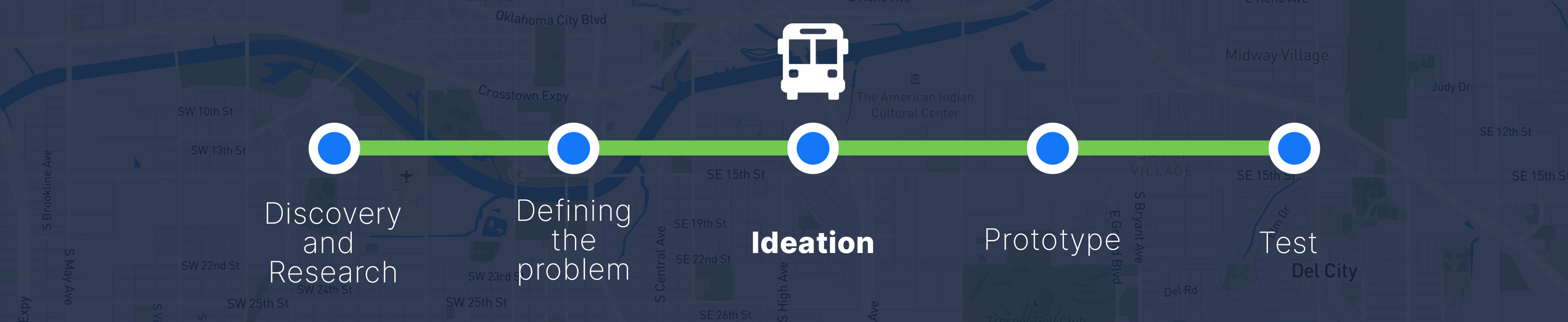
Ideation
Before diving into sketching out my preliminary design solution, I realized that part of my design process needed to consider all the various use cases a bus rider may encounter and ensure the design adheres to those needs. To do this, I started by defining my user stories.
AS A DAILY COMMUTER...
HIGH PRIORITY
MEDIUM PRIORITY
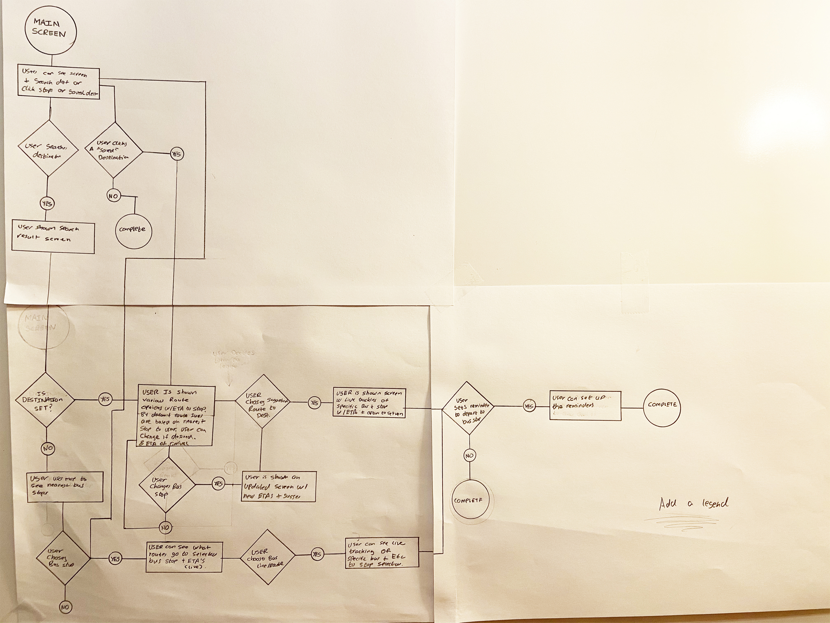
When a user opens up the app, they are going to fall into one of three scenarios.
With this in mind, I was able to solidify my final user flow and begin sketching out my design solution.
Sketches
As I began to sketch out my design, I realized one of the challenges I faced was accommodating all the information a user expects to see in a transit app. So as I began to sketch out my design, I knew I needed to develop a sense of hierarchy to avoid a user feeling stressed and frustrated when using the app.
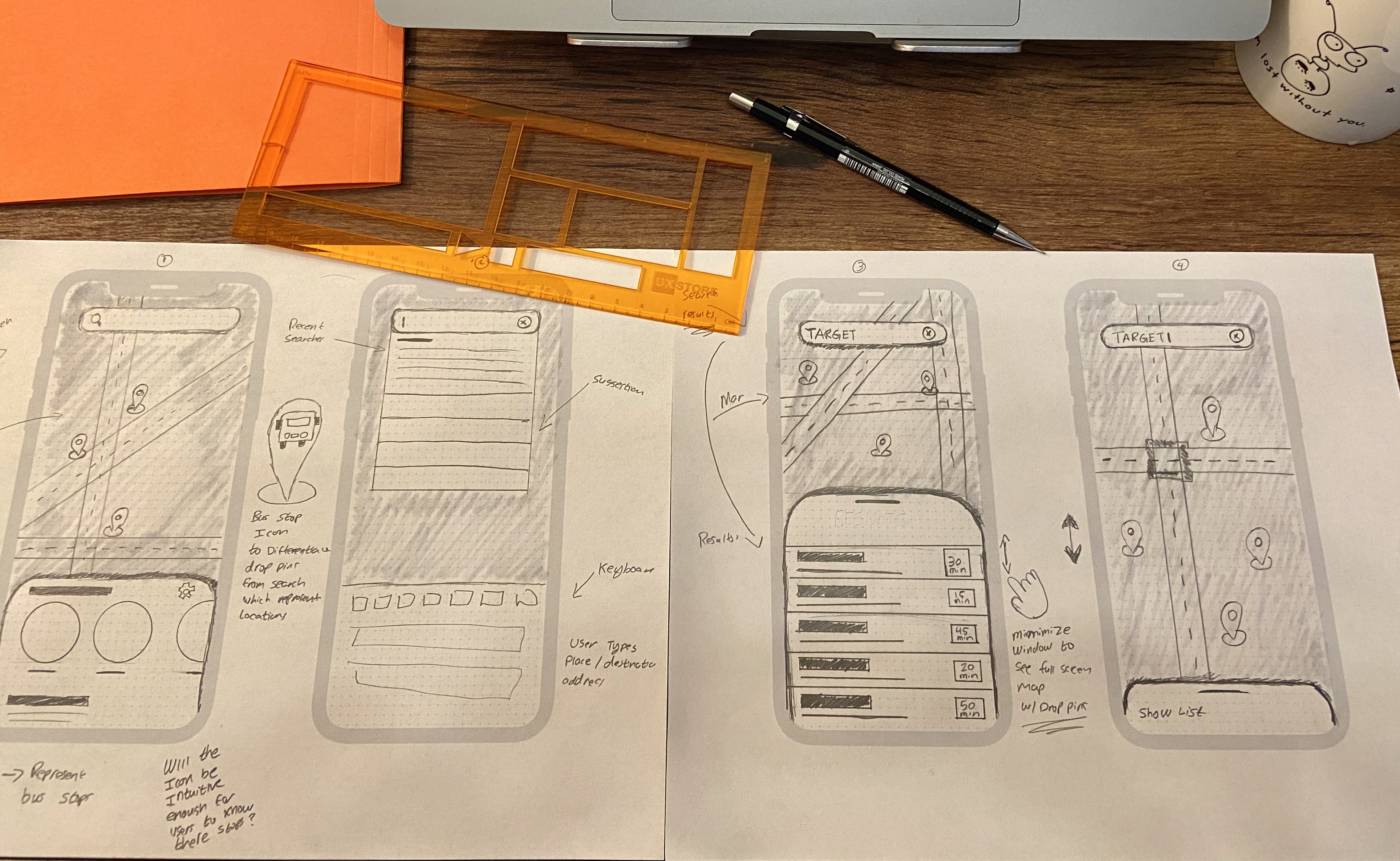
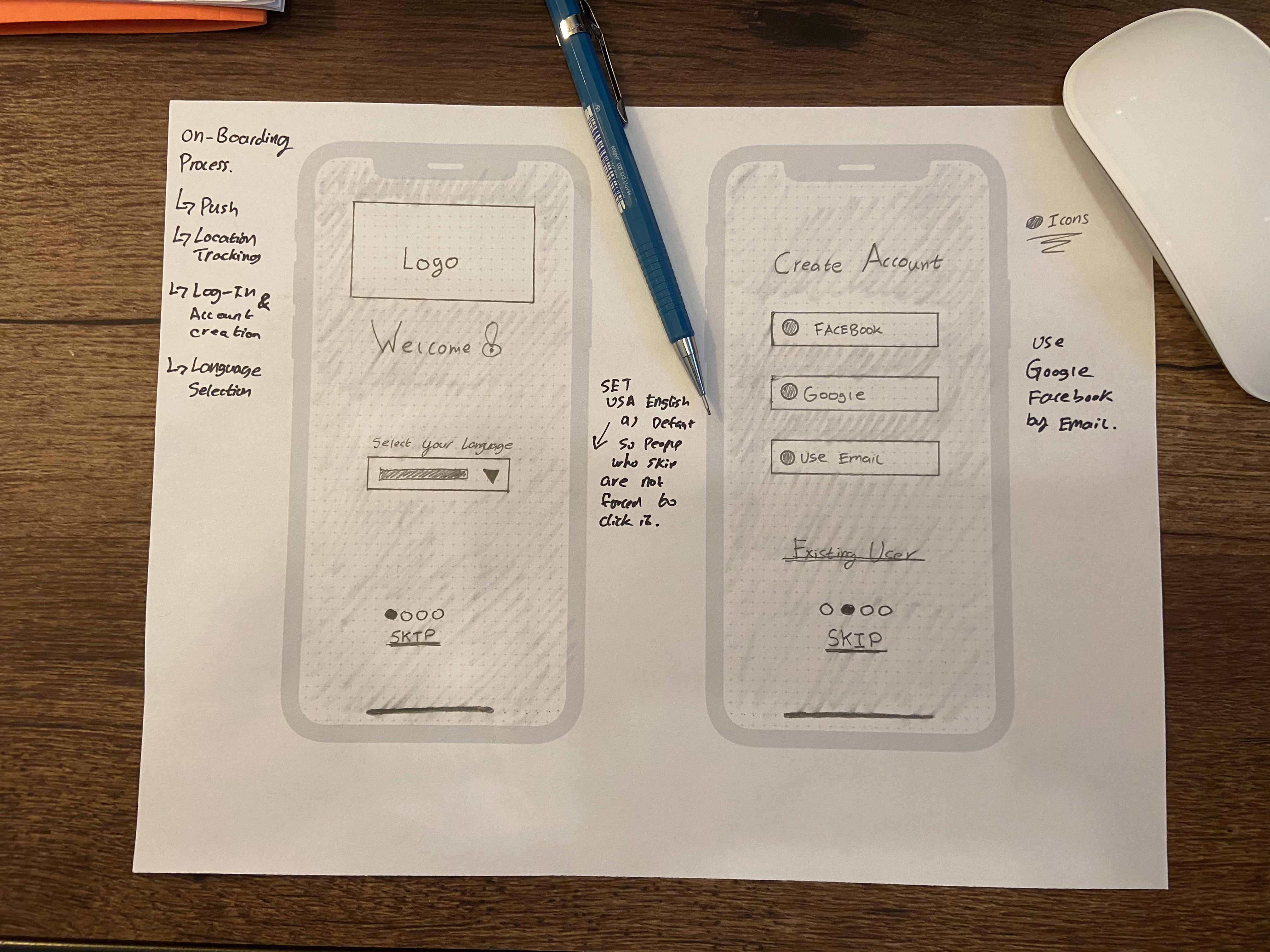
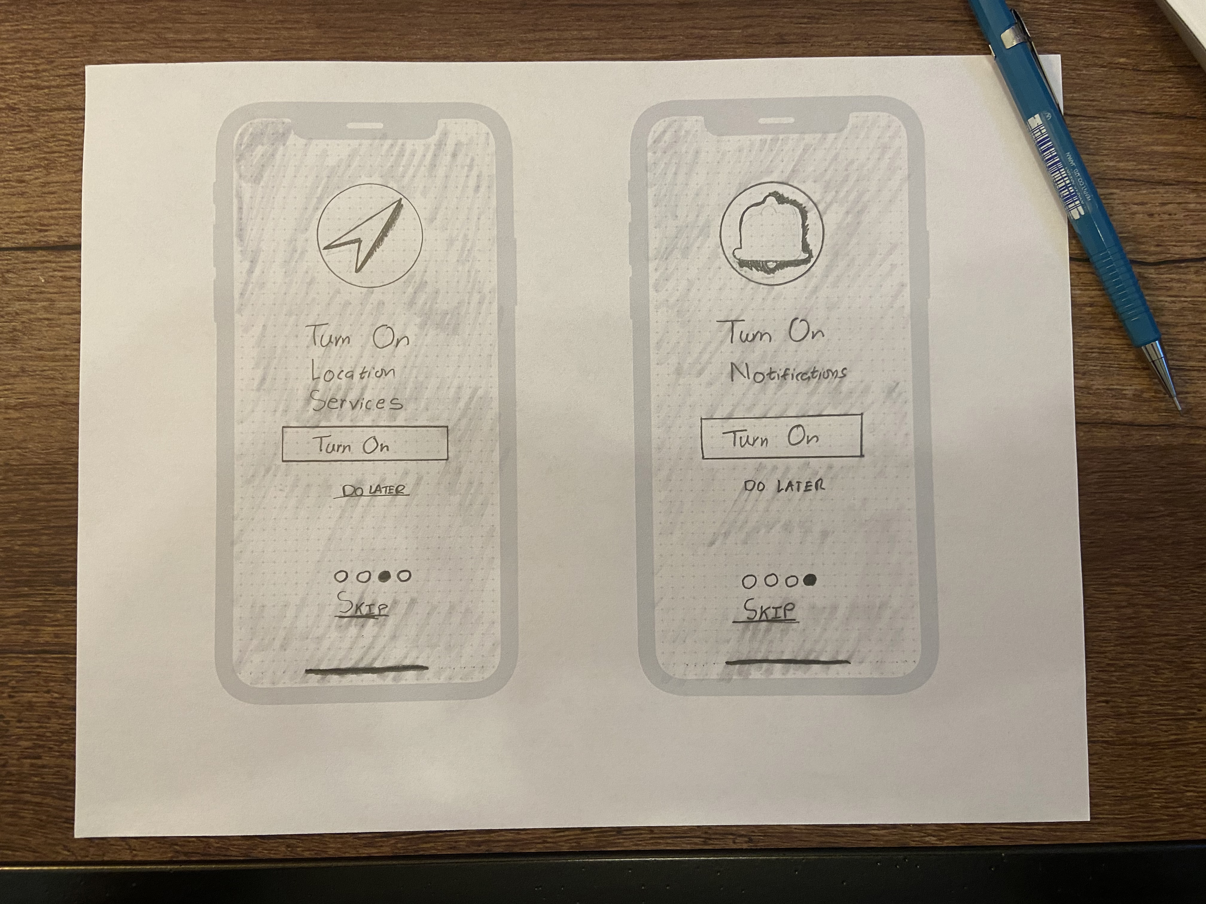
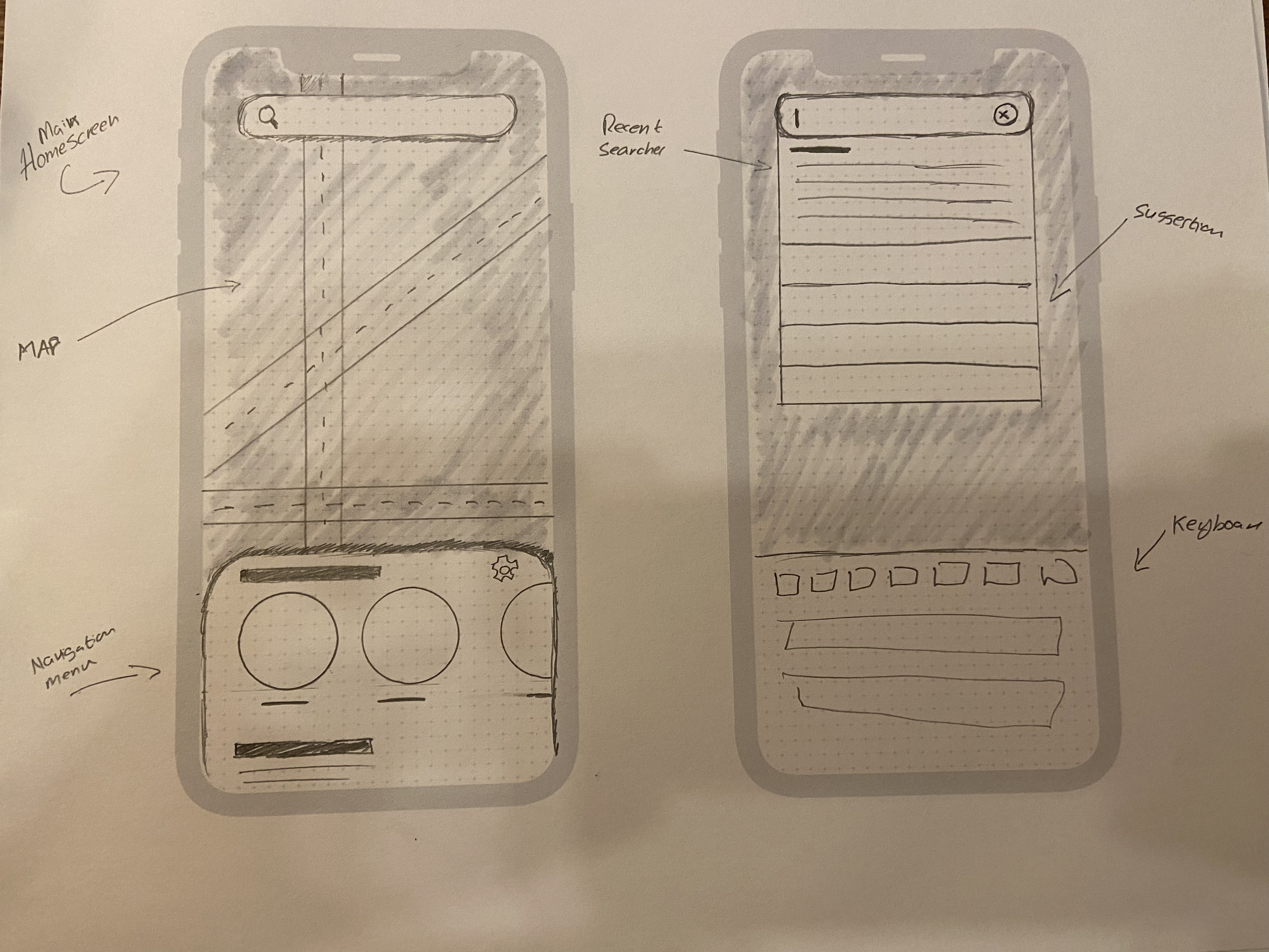
Because an overwhelming number of people use Google Maps, I wanted to design an app that did not grossly deviate from Google Maps' mental model in order for the app to build trust and allow for quick user adoption.
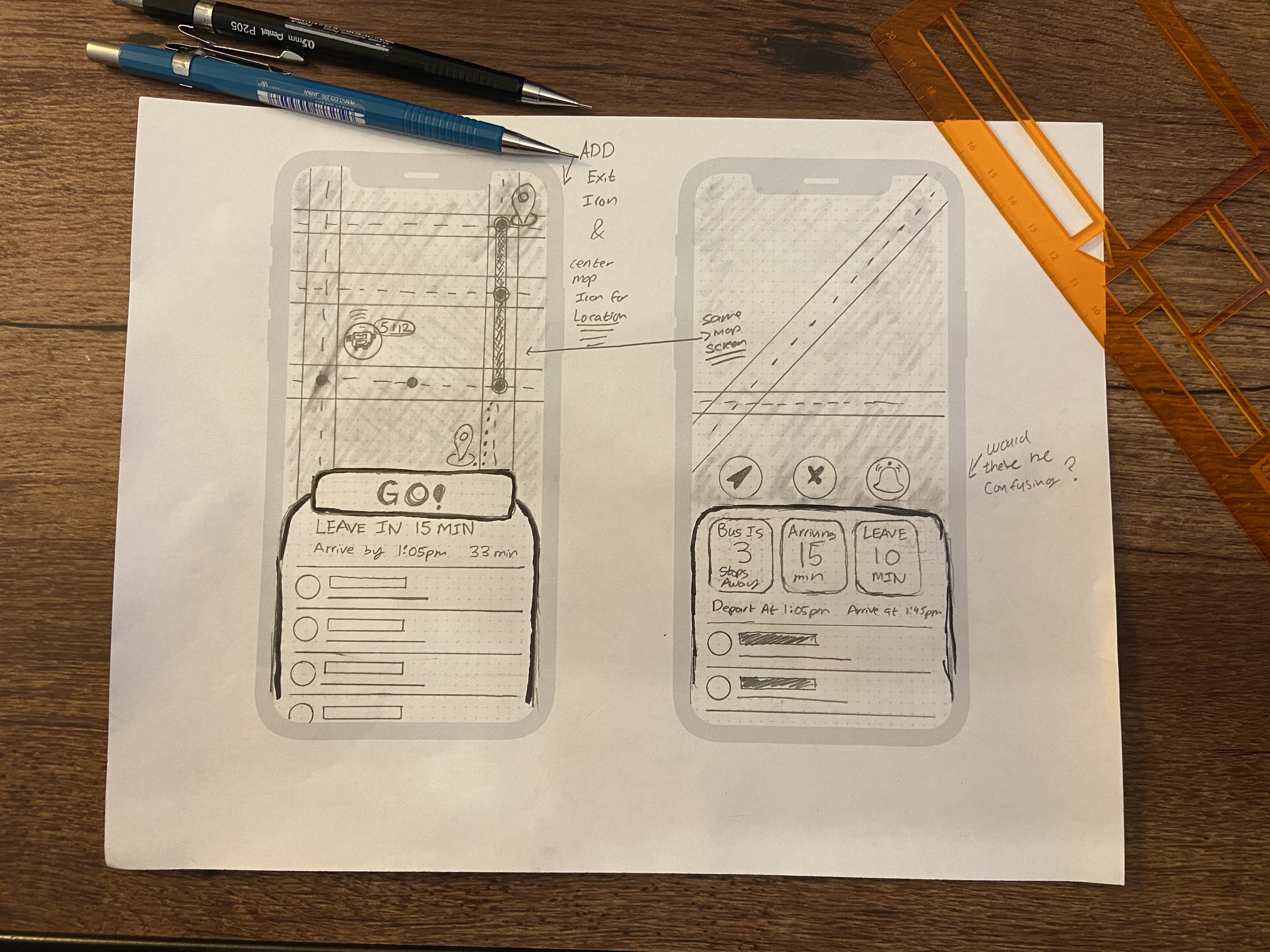
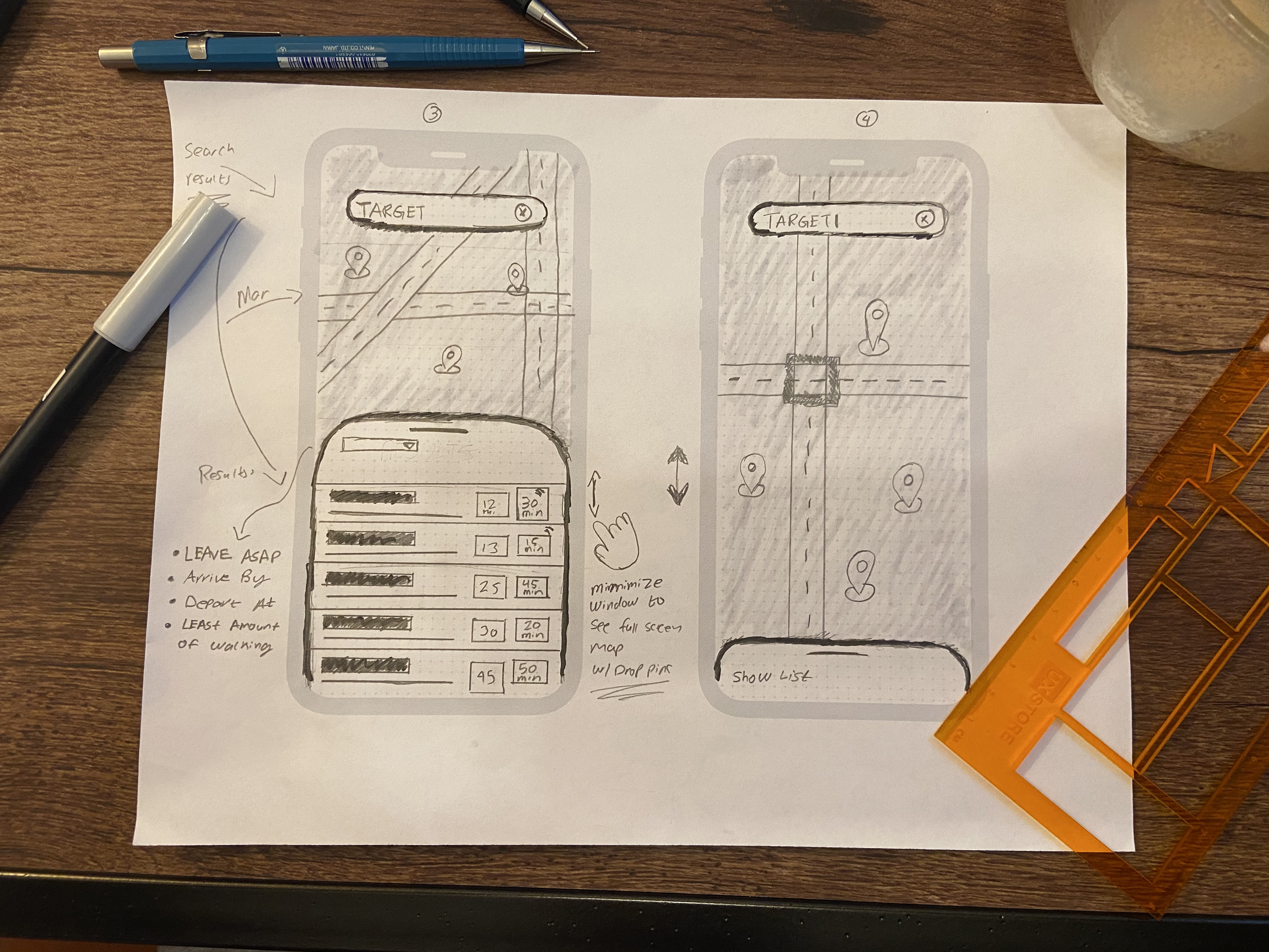
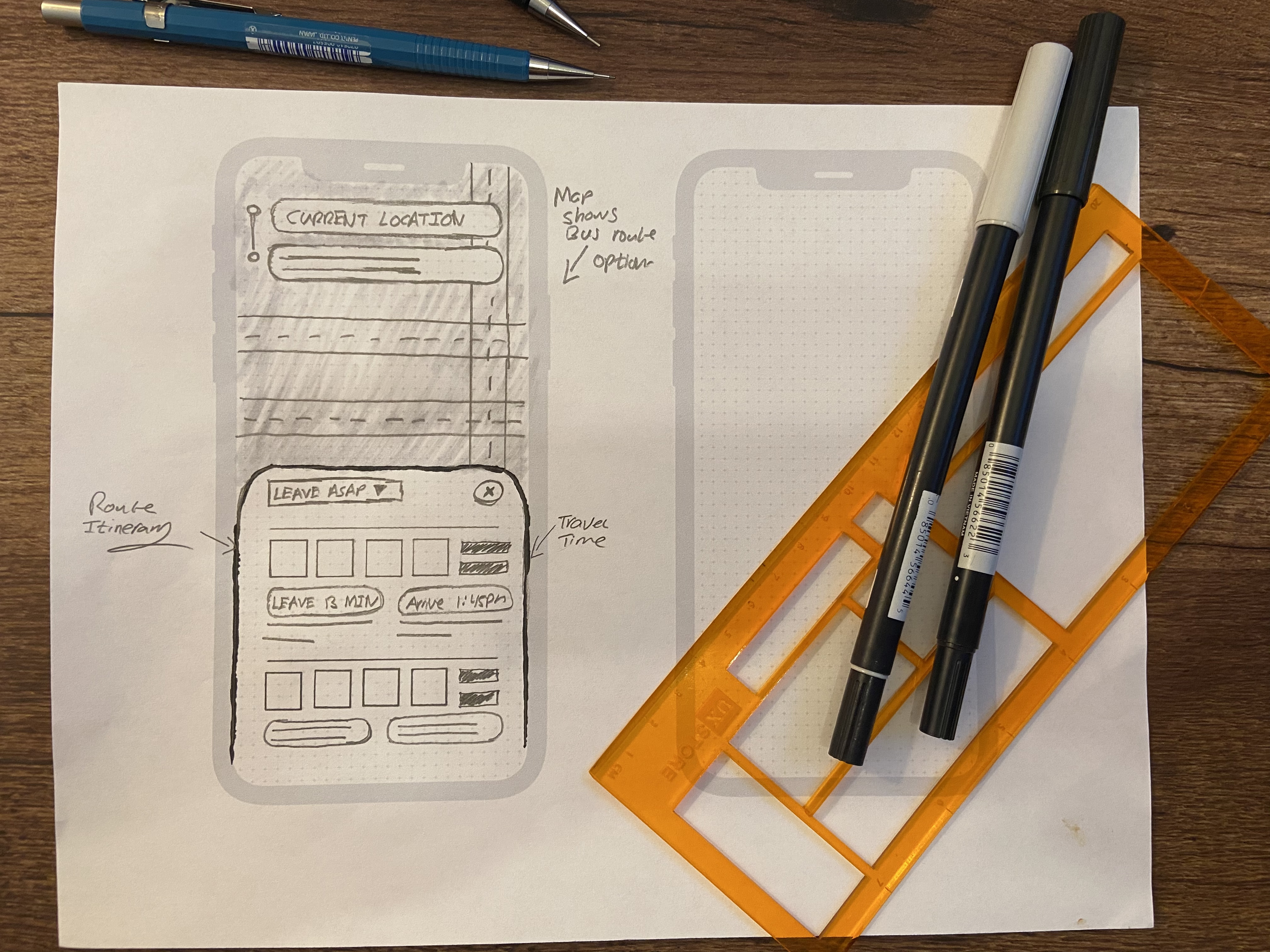
Wireframes
During this process, I was able to refine the app's information hierarchy. Based on user feedback I conclude that the most important information to communicate with the user was how many minutes they had left before they needed to start navigating to the bus stop.
Another aspect I did not consider during the sketching phase which came to my attention as I was wireframing and seeking feedback was the language and the way I communicated to users.
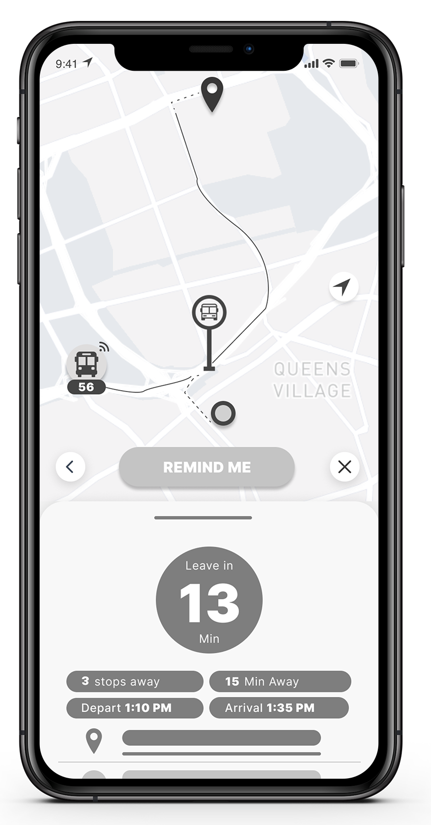
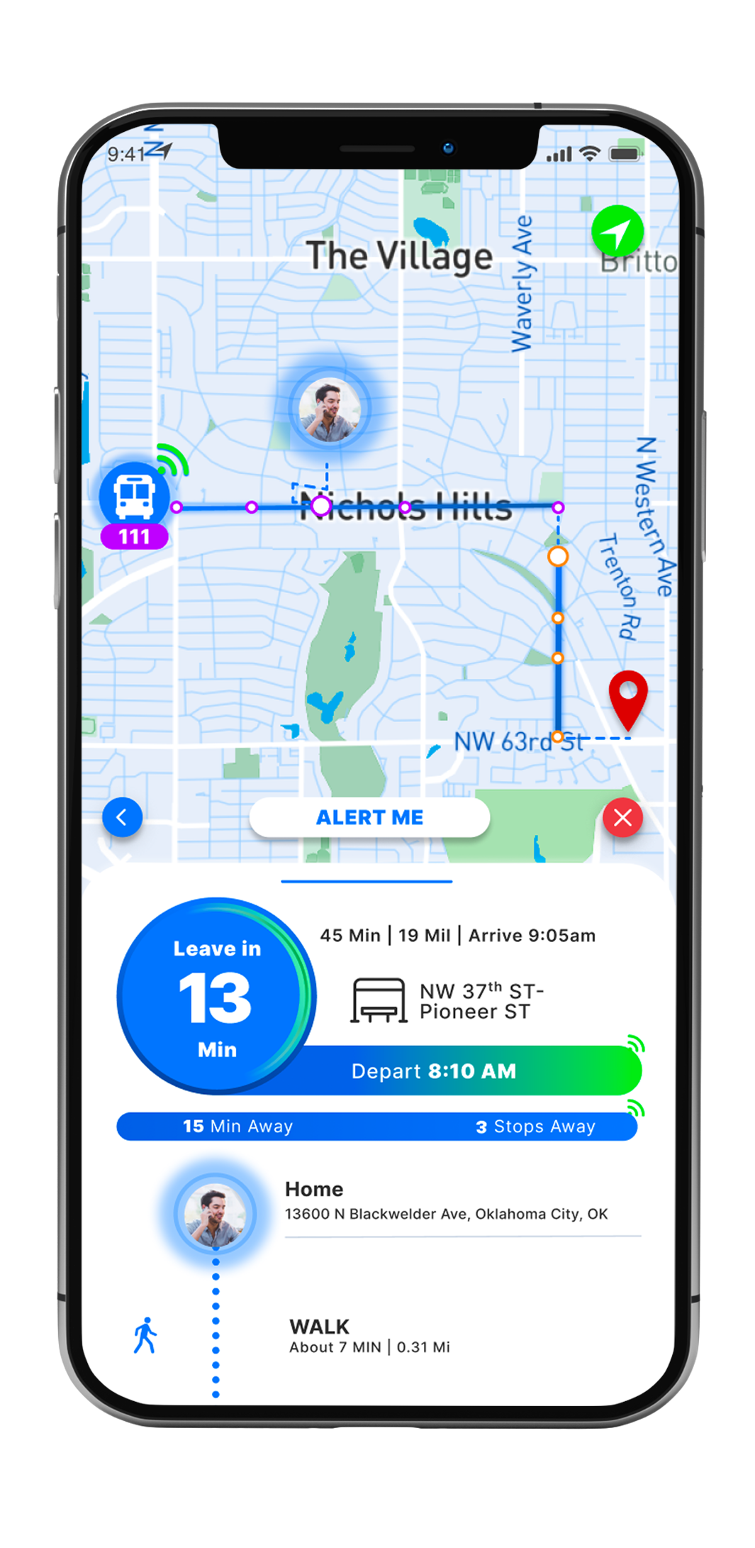
For example, I struggled in deciding what was more effective, "Leave in 13 Min," indicating the user needed to leave their current location and make their way to the bus stop in 13 min. Or, "Walk to the bus stop in 13 min". At this point, I decided to go with what I felt was the most straightforward and later validate or disprove my decision during the testing phase.
But before I could get there, I was at a crossroads. Do I test and iterate my design solution in its wireframe state? Or do I attempt to test my solution in high-fidelity formate and move forward with its development?
Since I was on a bit of a time crunch and felt that I would get better insight if I tested my high-fidelity solution, I decided to move forward and develop my high-fidelity prototype.
High-Fidelity Mockups
Version 1.0
As I dove into developing a high-fidelity version of my wireframes, I started to think critically about the color scheme I wanted to use. Knowing many bus riders get frustrated during their commutes and have a massive distrust in the bus system due to lack of transparency. I asked myself what colors can I use to bring peace and calm to users. BLUE!!
According to many studies and color psychology, the color blue is closely associated with trust and calm. Which lead me to developing the UI with a predominant blue color scheme.
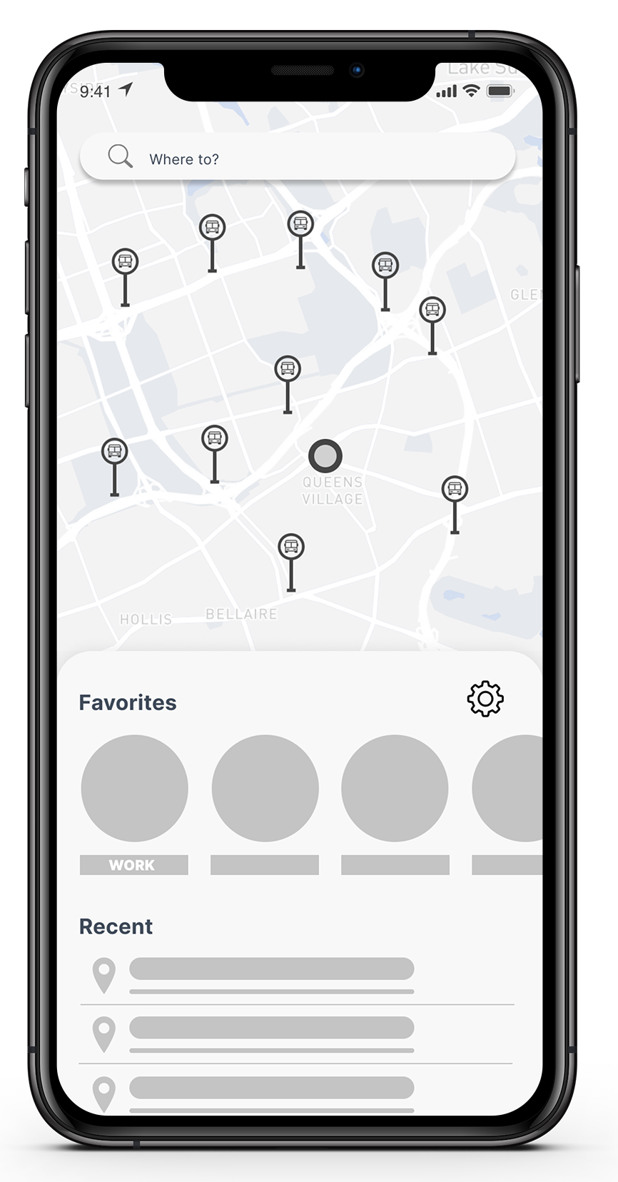
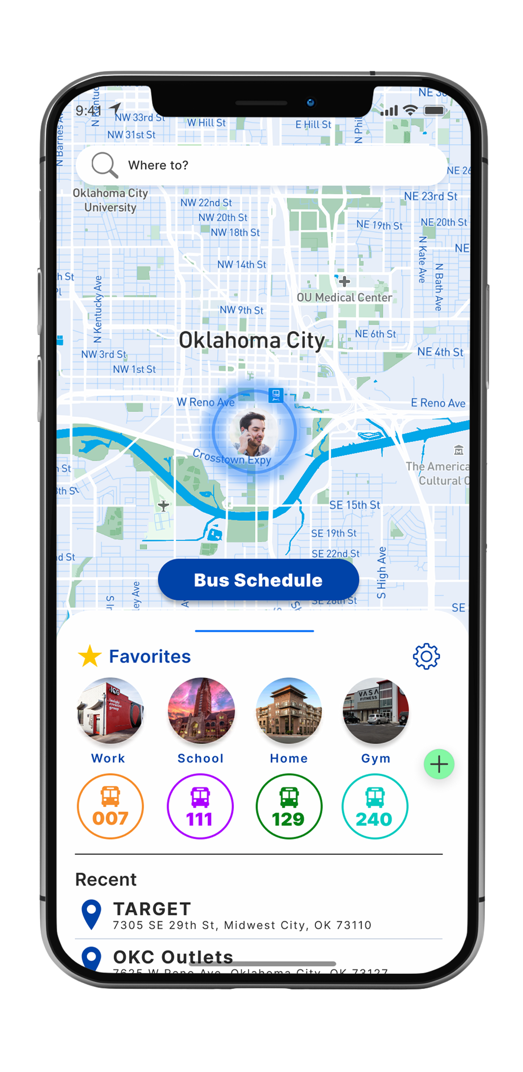
Homescreen
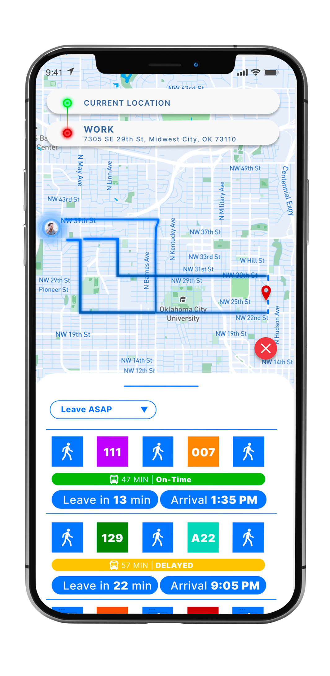
When transitioning my home screen from wireframes to a high-fidelity prototype, I added the functionality for users to save their frequently used bus routes. My research supported this decision, which indicated 93% of the survey responses use the same routes on their commute. Therefore aligning with one of my initial problem statements,"How may we create an app that allows riders to quickly access the relevant information they need to know for their daily commute." In my design solution, a user can quickly access recently traveled and searched destinations, along with the bus schedule from one tap. I decided to implement this because these functionalities are buried under several taps in Google Maps, making it cumbersome to access the relevant information a user would need quickly.
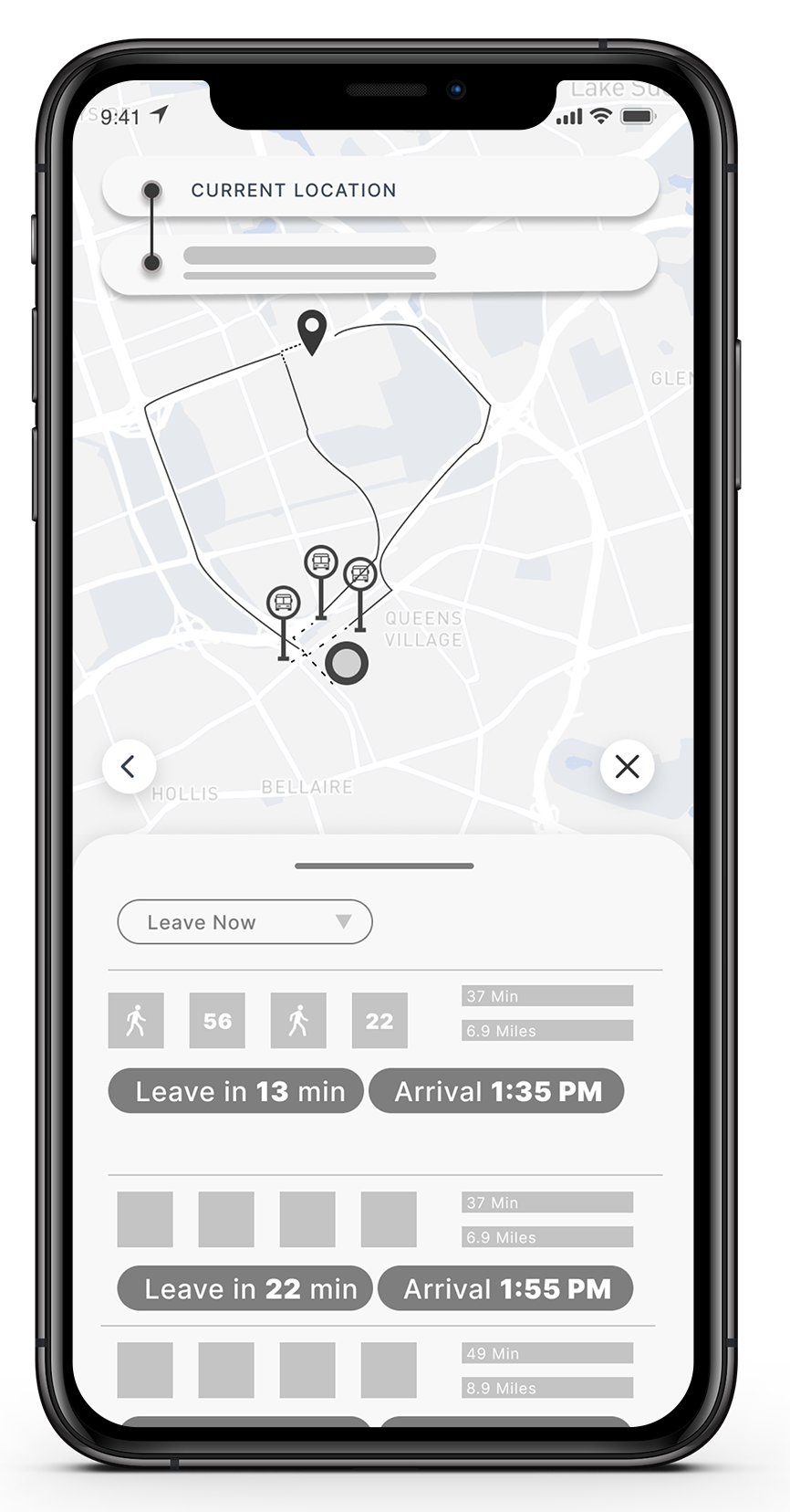
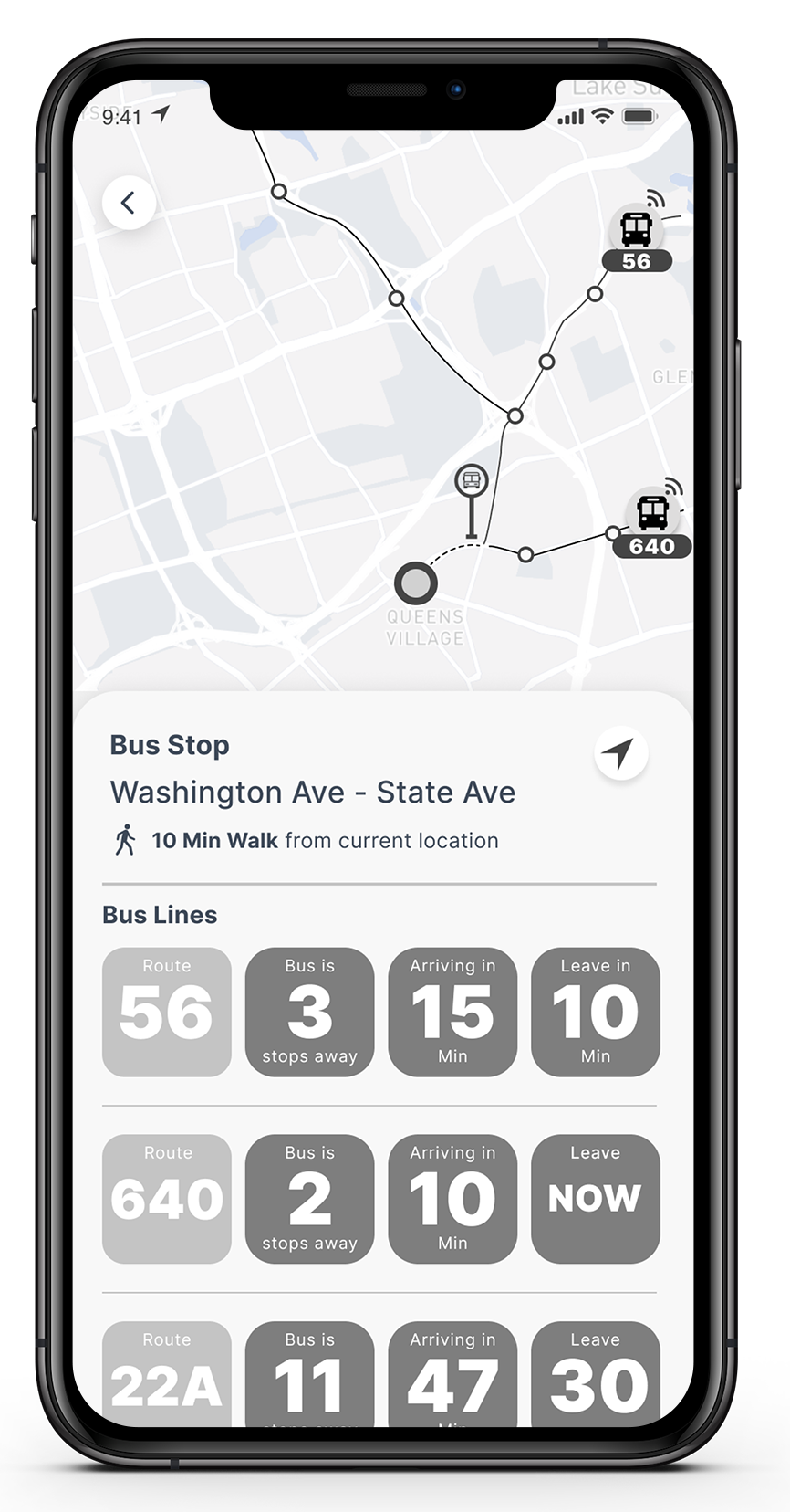
Route Options Detail Screen
The idea behind the route option screen was for the user to make a fast and informed decision about what route to take regardless if they were traveling to a new destination or a frequently visited place like their work. Since many bus commuters face a lot of stress and anxiety when taking the bus, I wanted to make it easy for the user to get fast and visual confirmation if:
Route Screen
With the same idea in mind as the "Route Options Detail Screen." I wanted to make it very easy for the user to get fast visual confirmation on the information they wanted to know. With that in mind, I laid out the screen so the focal point would be on the countdown timer so the user can quickly identify if their bus will be late and not feel rushed going to the bus stop.
With my prototype completed, I conducted ten rounds of usability interviews. Four of the interviews were people who opted to participate in an interview when completing my survey. The other six were classmates of mine. These were the scenarios I created to test my prototype.
Scenario #1
Scenario #2
Scenario #3
Feedback
Let's Work Together!